Before I comment on the school board coming to its senses this week about a name and mascot for the consolidated high school, let me say something about the scary ways the internet seems to know what we are doing with our days.
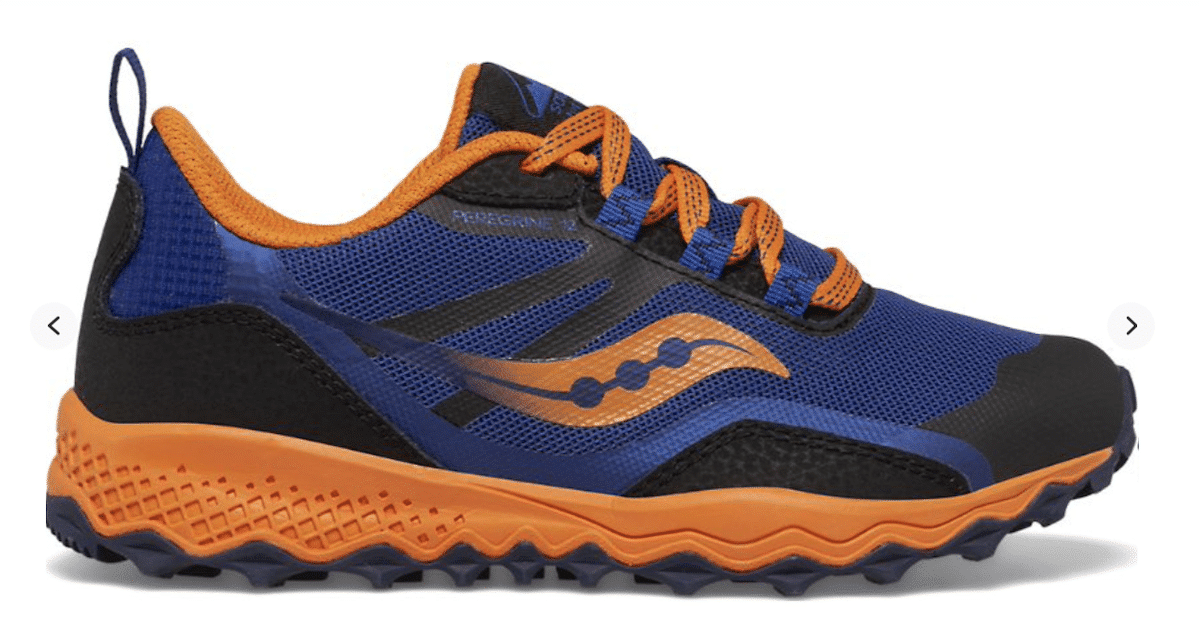
See that photo of the tennis shoe?
That is a Saucony, my current favorite brand of athletic shoes. The colors are blue, orange and black — the same color scheme the Christian County Board of Education approved for the consolidated high school, which will be named (thank goodness) Christian County High School and have a Tigers mascot.
- SUBSCRIBE: Sign up for our newsletters
The photo of this shoe arrived Friday in an advertisement that appeared on my Facebook feed. In other words, hours after I wrote and published a story that mentioned the selection of these three colors for the new school, the internet knew to toss an ad to me of my favorite shoe brand in those colors. Coincidence? I don’t think so.
Now back to the school name.
Last year, the school board seemingly relied on a poll of students, school employees and community members and voted to name the school Hopkinsville Christian County Academy.
Rolls right of the tongue, doesn’t it?
After that decision I wrote about the confusion and lack of identity the name would create.
Would the initials be HCCA? And wouldn’t that be too close to acronyms of our community college (HCC) and our local Christian school (HCA)? Further complicating things, two local private schools — Heritage Christian and University Heights— each has academy in their name.
The logical solution was there all along, especially since the county has long had two public high schools (not counting the relatively new Gateway Academy for career and tech learning). Take the name of one school and the mascot of the other, then pick a color from each one, and you’ve created an identity than gives both schools a reason to connect.
In my opinion, there was one wrinkle in the recommendations from Superintendent Chris Bentzel at Thursday’s meeting.
He asked the board, and the members agreed, to declare two additional colors — yellow and white — to accent the school’s main colors.
Bentzel said the five colors would touch on all of the high schools that existed prior to the first consolidation of the old rural schools at Pembroke, Crofton, South Christian, Sinking Fork and Lacy in 1959, and the desegregation of Attucks in 1967.
OK, that’s a nice nod to history, but not practical. This is where more is not more. Too many colors dilutes the identity.
I think time will take care of things. The two accent colors will fall away or become inconsequential.
And really, if yellow and white were necessary, don’t you think the magical algorithm of the world wide web would have sent me ads for tennis shoes in all five colors?
Jennifer P. Brown is co-founder, publisher and editor of Hoptown Chronicle. You can reach her at editor@hoptownchronicle.org. Brown was a reporter and editor at the Kentucky New Era, where she worked for 30 years. She is a co-chair of the national advisory board to the Institute for Rural Journalism and Community Issues, governing board past president for the Kentucky Historical Society, and co-founder of the Kentucky Open Government Coalition. She serves on the Hopkinsville History Foundation's board.